$ open devpulse/brand-guidelines
DevPulse Brand guidelines
version 1.0 · october 2026
Tech, in person.
devpulse
Tech, in person.
DevPulse is a tech community for the start-up and tech scene. We run evening meetups: talks, food and drinks, for people who build.
Founders, developers, designers and everyone else making things in start-ups and tech companies come to learn, meet their peers and be seen. Speakers bring the talks; host companies open their doors for an evening.
Zwolle is home today, and the events happen in and around the city. The identity is built to travel: nothing in it depends on one place. One day there may be a conference, and every part of this system is made to scale to it.
who this book is for
- volunteers
- make a poster, a post, a badge
- speakers
- how your talk and photo appear
- hosts
- how your venue and logo are named
- sponsors
- how partner logos sit beside ours
- designers
- the whole system, page by page
an evening, as a log sample date and venue
> doors openspoorzone, zwolle
foodtalks from 19:00
talkthe-state-of-web-components-in-2025
talkai-is-easy-until-you-add-people
drinksuntil the last commit
Everything is made of characters. Colour is depth. Type is the grid.
- 01Rooted, not bound.
Proud of where the events happen, but the identity travels. The city is venue information and one merch line, never the system.
- 02People first.
Speakers and attendees are the content; the brand frames them. Real faces stay photographic where it counts.
- 03Confidence without hype.
A bold voice and honest facts. No invented numbers, no superlatives.
- 04Built to scale.
Every asset works for a 60-person meetup and for a future conference.
The wordmark.
wordmark · construction · clear space and sizes · colour versions · don’ts
One word. A pulse runs through it.
- what
- The logo is
devpulsein JetBrains Mono ExtraBold, lowercase. Nothing else: no symbol, no caret. - when
- Everywhere the brand signs: posters, feeds, slides, badges, the site.
- how
- On screen a pulse of colour runs through the word, letter by letter, every 2.8 seconds. In print, in PDFs and wherever motion is off, use the still.
The static logo is the colour-steps still. dev in ink, pulse stepping cobalt to terracotta, one ramp step a letter: the long exposure of the pulse, everywhere it has been. Plain ink is the one-colour version, not the logo.
devpulse
on screen / travelling pulse 2.8 s loop · 90 ms a letter- devpulse0.2 s
- devpulse0.4 s
- devpulse0.6 s
- devpulse0.8 s
- devpulse1.0 s
- devpulse1.3 s
devpulse
print / the still · the logodevpulse
one colour / inkEight cells, one line.
The word sits on the same character grid as everything the brand writes. Each letter takes one cell: 0.6 em advance minus 0.02 em tracking, 1.2 em tall. The type is set on the x-height, and one empty cell of clear space surrounds it on every side.
Room to breathe. Never too small.
- what
- One cell of clear space, a minimum size per version, and a rule for when the pulse moves.
- when
- Every time you place the wordmark.
- how
- Measure clear space in cells of the word itself: one cell is about the width of one letter. Nothing enters it, not even a partner logo.
devpulse
devpulse
64 pxdevpulse
40 pxdevpulse
24 px · smallest with colourdevpulse
16 px · one colour only| screen | ||
|---|---|---|
| colour steps | 24 px type · 112 px wide | 30 mm wide |
| one colour | 16 px type · 75 px wide | 18 mm wide |
| avatar | one of three square cuts, 1,024 px, see p.-- | – |
| smaller | the ripple, the icon, see p.-- | the 25 mm pin, see p.-- |
travelling (animated)
- the site header and hero
- the stage screen between talks
- video, stories and event pages
the still
- print, PDF, email and documents
- anywhere reduced motion is on
- below 40 px, or next to other motion
Two primary grounds. One colour for the rest.
- what
- The ramp on paper and on ink. A single colour everywhere else.
- when
- Paper and ink grounds take the ramp. Cobalt, apricot and signal grounds, and one-colour print (stamps, receipts, embroidery, engraving), take one colour.
- how
- On ink, the ramp flips: dev turns paper and the pulse starts in warm light.
download
SVG and PNG are transparent, JPEG carries its ground. Every file holds one cell of clear space around the word. Made by tools/wordmark.











Leave the word alone.
The wordmark works because it is plain. Every one of these takes something away. If a layout seems to need one of them, change the layout.
devpulse_
devpulse
devpulse
devpulse

devpulse
devpulse
devpulse
devpulse
Colour and type.
palette · depth ramp · typography · the character grid
Six colours, named by what they do.
Paper and ink carry everything: grounds and information. Cobalt and apricot are the cool and warm halves of depth. Signal is a status light, used once. Haze holds the grid together. CMYK and Pantone references are to be defined with the printer.
#F1EEE6rgb 241 238 230
The primary ground: posters, print, the page.
#141318rgb 20 19 24
All information text. The densest glyphs. The night ground.
#3341D6rgb 51 65 214
The cool shadow. Commands, the event shape behind speaker photos.
#EE9A62rgb 238 154 98
The warm light. Sparse glyphs, prompts on night. Never body text on paper.
#E5412Brgb 229 65 43
Live and status words. Once per surface, never the wordmark.
#DAD5C8rgb 218 213 200
Rules, grid dots, the surface under objects.
supporting neutrals
graphite#5F5B54 secondary text on paper
fog #A9A59B secondary text on ink
desk #E3DED2 under objects
card #FBFAF6 badges, receipts
Colour is depth.
- what
- Nine steps per ground. A density value sets the glyph, its weight and its colour together.
- when
- Anything drawn in characters: shapes, numerals, the pulse graphic.
- how
- Let the renderer pick. A ramp colour is never chosen by hand.
- Colour is depth. A ramp colour comes only from a density value or a pulse step, never from a wish for emphasis.
- Information is ink. Text that informs stays ink on paper or paper on ink; graphite and fog for secondary lines.
- Matched contrast. A density holds the same contrast on both grounds, from 2.4:1 at
.to 15.9:1 at@, so a detailed drawing reads as well on paper as on night. - Signal once. One live or status word per surface. The wordmark never spends it.
paper
- .1 · 300
#DC8833 - :2 · 300
#CF742C - -3 · 400
#B9663B - =4 · 400
#AB4C5E - +5 · 500
#843E74 - *6 · 600
#54369E - #7 · 700
#342D91 - %8 · 800
#20235A - @9 · 800
#141318
night
- .1 · 300
#3B44B8 - :2 · 300
#5B51B8 - -3 · 400
#825DAC - =4 · 400
#B6668B - +5 · 500
#D77C73 - *6 · 600
#EA8F64 - #7 · 700
#F0A979 - %8 · 800
#F2CEAF - @9 · 800
#F1EEE6
the wordmark’s five steps
paper
ink
Tuned from the ramp so every letter holds 3:1 against its ground.
One family. Weight does the rest.
JetBrains Mono
abcdefghijklmnopqrstuvwxyz
0123456789 >_ [ ] { } -> :: @
- 300Talks. Food. Drinks.
- 400Talks. Food. Drinks.
- 500Talks. Food. Drinks.
- 600Talks. Food. Drinks.
- 700Talks. Food. Drinks.
- 800Talks. Food. Drinks.
Free under the SIL Open Font License, from Google Fonts. Ligatures and contextual alternates are always off, so -> stays two characters. Numerals are tabular.
AI is easy - until you add people.
Meetup No. 14 · Spoorzone, Zwolle
Tech, in person. Talks, food and drinks for people who build.
Every evening starts at six with doors and food, talks at seven, drinks at nine. Set body text ragged, 60 to 70 characters a line.
> talk --speaker "tomas francisco"
thu 12.11.2026 · spoorzone, zwolle sample
- Titles in sentence case, with a full stop.
- Meta in lowercase log style: dates as 12.11.2026, times as 19:00.
- Commands in cobalt on paper, apricot on ink.
Columns are counted, not measured.
- what
- Every surface is a grid of 1:2 cells, 0.6 by 1.2 em. A cell holds one character, one weight, one colour.
- when
- Always: text, art and layout share it.
- how
- Pick a column count for the artwork, then let the box size the type:
font-size = box width ÷ columns ÷ 0.6. Text blocks start on a cell; nothing moves by half a cell.
| surface | ratio | columns |
|---|---|---|
| enamel pin, 25 mm | 1:1 | 14 |
| badge shape | 1:1 | 22 |
| instagram post | 1:1 | 96 |
| talk poster, A2 | 1:1.414 | 88–104 |
| stage backdrop | 16:9 | 168 |
Graphics.
pulse graphic · icons · event shapes · speaker photos
Pulses of characters.
A source sends rings of characters outward. Each ring steps down the depth ramp as it travels: dense and dark at the source, sparse and warm at the edge. It is the brand’s motion, and it is never the logo.
export gif
export gif
devpulse
export gif
rsvp devpulse.nl/rsvp
export gif
Motion. 27 frames at 24 fps: 0.9 rings a second. It plays only while it is on screen.
Still. Frame 0, in print, in PDFs, under reduced motion and on first paint.
Export. In this book’s browser view, export gif writes the loop at 1080 px wide, in the exact brand colours, looping forever.
Never a lockup. The rings never stand next to the wordmark as a logo. See the don’ts, p.--. The avatar is a picture, not a lockup, p.--.
Icons: borrowed, never drawn.
- what
- Pixelarticons, an open-source set drawn on a strict 24 × 24 pixel grid. The free set, 1,036 icons, is MIT licensed: free, no attribution needed. Source: github.com/halfmage/pixelarticons.
- when
- Programme rows, wayfinding, the site, slides and feeds: wherever a word needs a quick picture beside it.
- how
- Take the icon from the set as it is. Never redraw one, never mix in another set. Missing a subject? Use the nearest icon in the set.
- Two cells. An icon is two cells wide and one tall, 1.2 em square, so it sits in a line like two characters. On screen: 24 px or a multiple.
- One colour. Ink on paper; paper or apricot on ink. Never ramp colours, never signal.
- doors
door-closed - food
cake - drinks
bottle-wine - coffee
coffee - talk
mic - slides
presentation - date
calendar - time
clock - venue
map-pin - people
users - news
megaphone - rsvp
qr-code - code
terminal - wifi
wifi - chat
message - route
arrow-right
cake: the set has no pizza.doors
food
talks
drinks
cd ./talks
cd ./food
cd ./drinks
thu 12.11.2026
doors 18:00
spoorzone, zwolle
| considered | icons | grid | licence | |
|---|---|---|---|---|
| Pixelarticons | 1,036 | 24 px | MIT | chosen: the most subjects, no attribution |
| Pixel Icon Library (HackerNoon) | 578 | 24 px | CC BY 4.0 | fewer event subjects, credit required |
| Streamline Pixel | 662 | 32 px | CC BY 4.0 | has pizza; off our grid, credit required |
Every event gets its own shape.
- what
- A lit form written in characters, generated from the event’s key, like
devpulse no.14. - when
- Behind every speaker on that evening’s posters and posts, large on the programme, small on the badge and the pin.
- how
- Make it in the shape lab from the key. Never draw one by hand: the same key always gives the same shape, so everything for one night belongs together.
- Six families, chosen by the meetup number: torus, terraces, superformula, lissajous, rings, polygon. A conference stacks two.
- Behind a speaker photo the shape is one cool hue. The cut-out stands in front of it; every text block knocks it out.
devpulse no.12
devpulse no.13
devpulse no.14
devpulse no.15
devpulse no.16
devpulse no.17
The shape lab · tools/event-shapes/
$ open tools/event-shapes/index.html roll, pin and edit layers, preview every poster, post, badge and pin; export svg, png, txt and looping gif
$ node tools/event-shapes/cli.mjs show 14 any event’s shape, in the terminal
$ node tools/event-shapes/cli.mjs publish my-shapes.json a lab file into the event registry
The real photo, as it was taken.
- what
- The speaker’s own photo in full colour, untouched apart from the cut-out.
- when
- Wherever people need to recognise the person: talk posters, speaker announcements, the event page, the slide before a talk.
- how
- Place it one of two ways, full frame or cut out on a flat brand ground. Speakers are never drawn in characters.
- As shot. Full colour. No tints, duotones, filters or blur.
- Square edges. No circles, no rounded corners, no shadows or outlines.
- Eyes on the upper third, the face looking into the page, toward the text.
- Cut by the bottom edge. A cut-out stands on the edge of the frame; it never floats.
- Text never crosses a face.
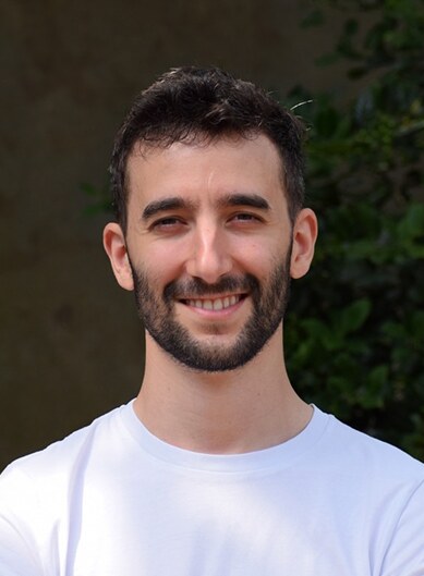 eye line · upper third
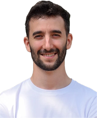 eye line · upper third
cut by the bottom edge
eye line · upper third
cut by the bottom edge
AI is easy - until you add people.
| we need | screen | |
|---|---|---|
| file | the original JPG or PNG from the speaker or photographer; never a screenshot or a copy from social media | |
| size | 1,080 px or more on the short side | 300 ppi at final size: a photo half the height of an A2 poster needs about 3,500 px |
| cut-out | transparent PNG or WebP, hair intact, cut below the shoulders | |
| light | even, directional light; no flat flash | |
| framing | head and shoulders, looking near the lens | |
| consent | a written yes from the speaker for the photo | |
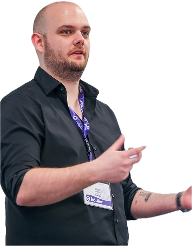
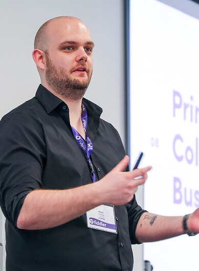
The organiser photos of Tomas and Marin are 389 px wide: enough for small screens only. For print, ask for the originals.
The person carries the poster.
The same rules on every surface: the photo carries the person, type carries the facts, and the evening’s shape or the pulse fills what is left. Tomas Francisco and Marin Niehues are real speakers; dates and venues are sample.
The state of web components in 2025.
tomas francisco
19:00 · talk 01
thu 12.11.2026
spoorzone
zwolle
devpulse
The state of web components in 2025.
tomas francisco · 19:00
thu 12.11.2026 · spoorzone, zwolle
> rsvp devpulse.nl/rsvp
devpulse
Meetup No. 14
tomas francisco
the-state-of-web-components-in-2025
marin niehues
ai-is-easy-until-you-add-people
thu 12.11.2026 · 18:00 · spoorzone, zwolle
devpulse
AI is easy - until you add people.
marin niehues
19:45 · no.14
> devpulse.nl/rsvp
tomas francisco
the-state-of-web-components-in-2025
19:00 · no.14
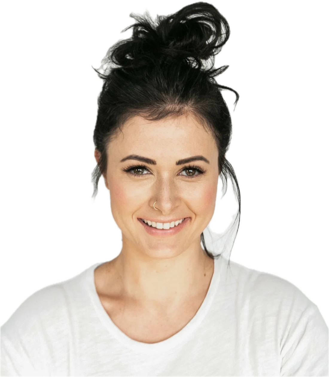
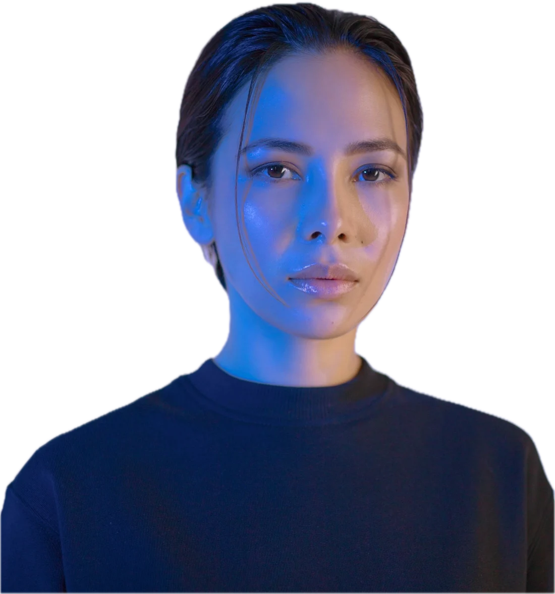
Let the photo be a photo.
Each of these hides the person or fights the type. Misuse is shown with sample portraits from Unsplash, never with a real speaker.

Your monolith is fine.

Applications.
talk poster · social · avatar · icon · on the night · merch
Anatomy of a talk poster.
- Wordmark corner. The still, top left, 1.8% of the width.
- Edition. Meetup number and poster count, top right.
- Event shape. That night’s shape in one cool hue, cropped by the edge.
- Photo. The speaker cut out, standing on the bottom edge, in front of the shape.
- Title. The talk as the speaker wrote it, sentence case, full stop.
- Meta. Speaker · time under the title; date and venue bottom left, lowercase.
A2 portrait, 420 × 594 mm. Side inset 6% of the width. The same layout scales to A3 and A4 without changes.
The state of web components in 2025.
tomas francisco
19:00 · talk 01
thu 12.11.2026
spoorzone
zwolle
AI is easy - until you add people.
marin niehues
19:45 · talk 02
thu 12.11.2026
spoorzone
zwolle
The same evening, cut to every feed.
One face, one title, one call to act per post. The event page carries both speakers; the post and the story each give one speaker the whole frame. The wordmark sits in the corner as the still.
devpulse
Meetup No. 14
Tech, in person.
tomas francisco
the-state-of-web-components-in-2025
marin niehues
ai-is-easy-until-you-add-people
devpulseno.14 · 12.11.2026
The state of web components in 2025.
tomas francisco
19:00
> devpulse.nl/rsvp
devpulseno.14
AI is easy - until you add people.
marin niehues · 19:45
thu 12.11.2026 · spoorzone, zwolle
> rsvp devpulse.nl/rsvp
One square, cropped round.
- what
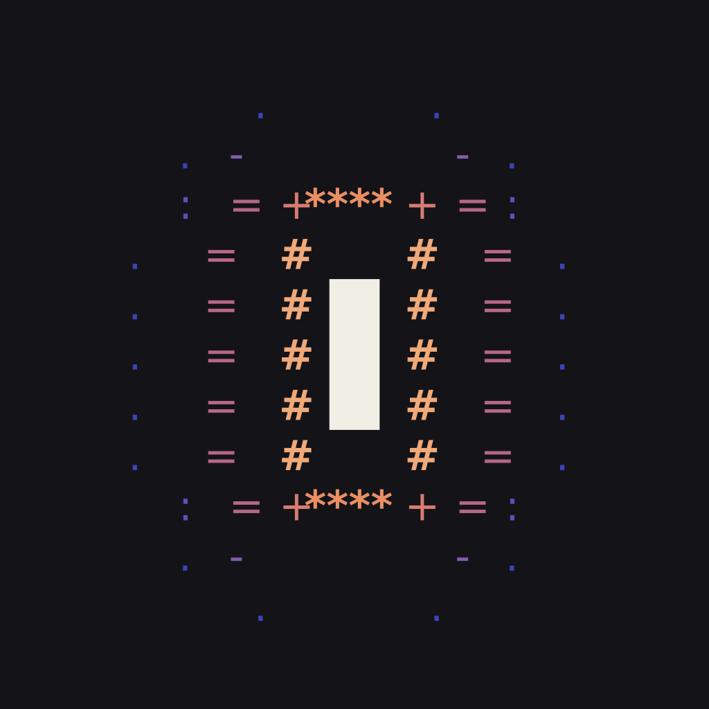
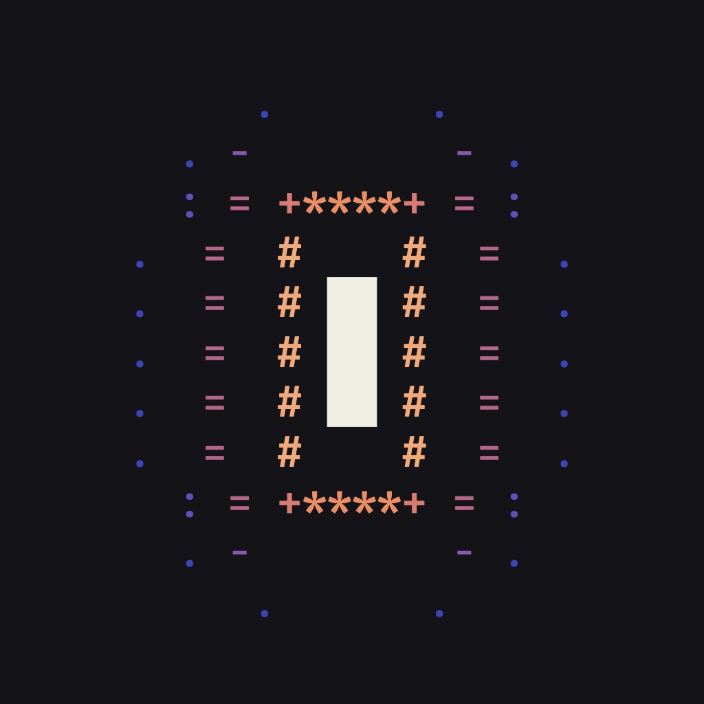
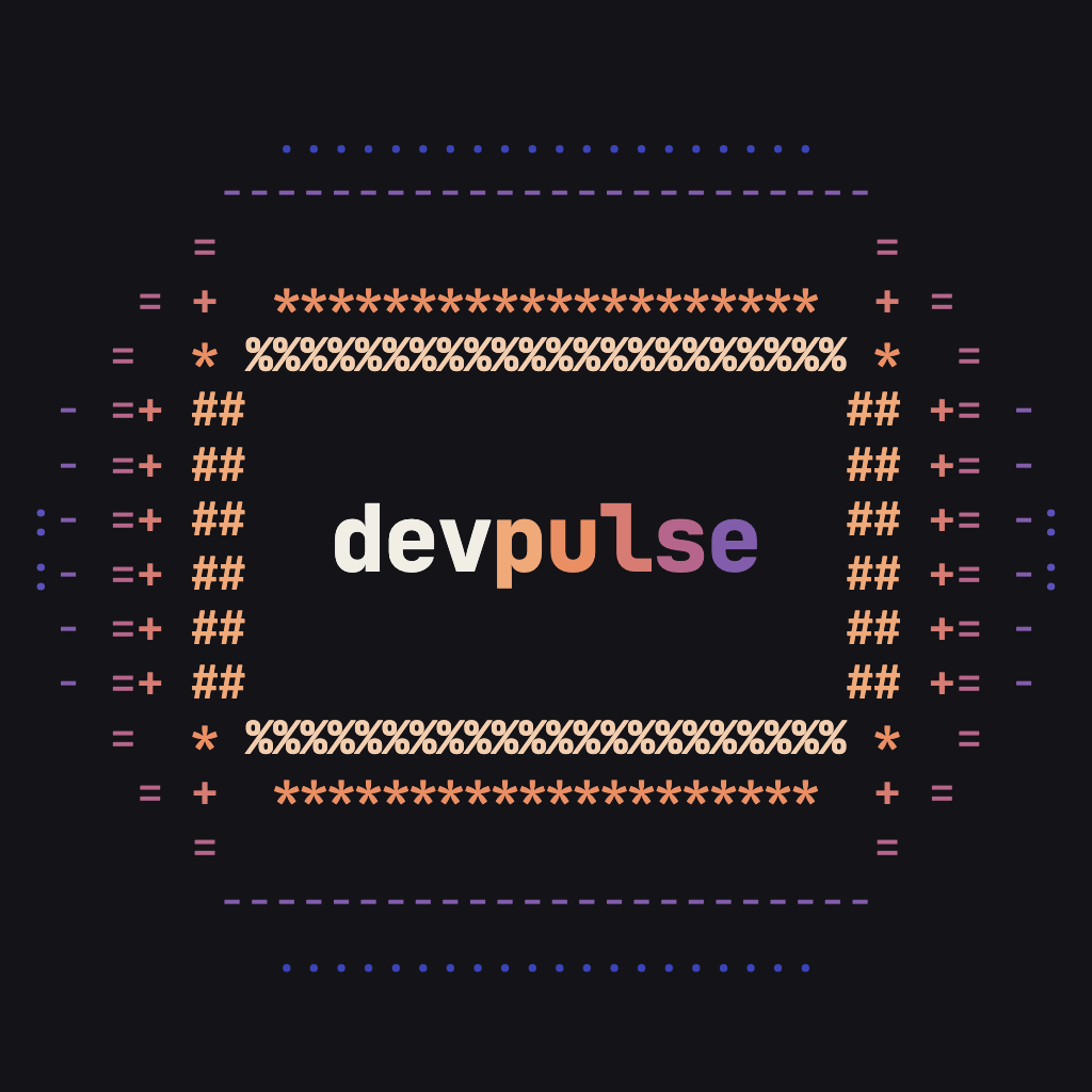
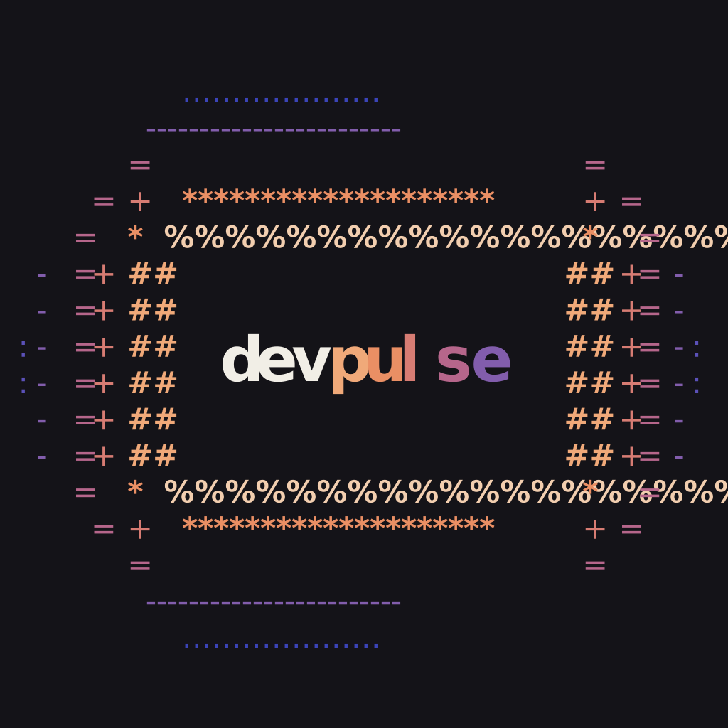
- Three avatars made of the broadcast pulse: the pulse with the word beneath, the pulse alone, and the word sending the rings.
- when
- Every profile picture: social accounts, the meetup page, GitHub, the newsletter sender. Workspace and server icons take the round icon, p.--.
- how
- Export from
tools/avatarat 1,024 px on ink and upload the square. The platform crops it round; every cut stays inside the circle.
- Pulse + word by default. Broadcast where the name already sits beside the picture. Word + rings for the main accounts, where the avatar is shown large.
- Use the file as it is. Never crop tighter, recolour, add a frame, a ring or a badge.
- Only the avatar. The word and the pulse meet here as a picture. Never place an avatar beside the wordmark or use it as the logo on a layout.
download
| file | PNG, 1,024 × 1,024 px; never from less than 400 px |
| ground | ink; paper only where the platform’s page is dark |
| crop | the square as it is; the artwork stays inside 96% of the circle |
| source | tools/avatar; the set in tools/avatar/exports |
The pulse, held still in a square.
- what
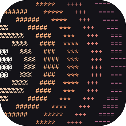
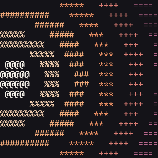
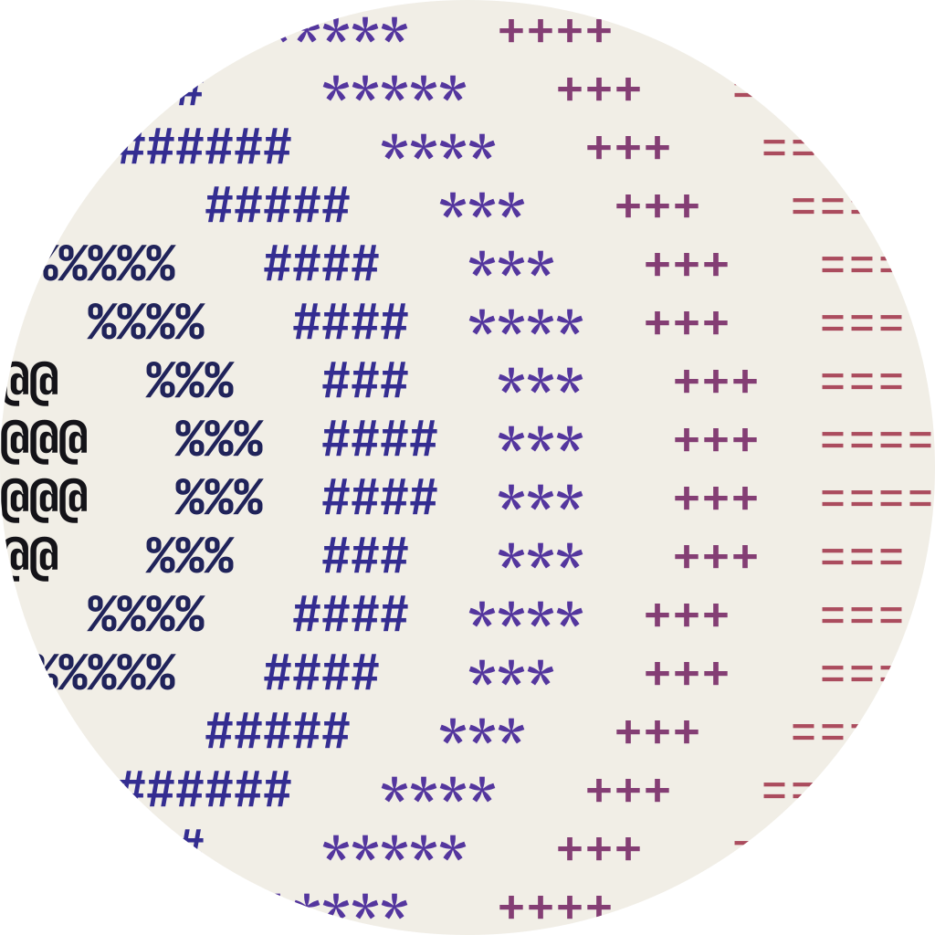
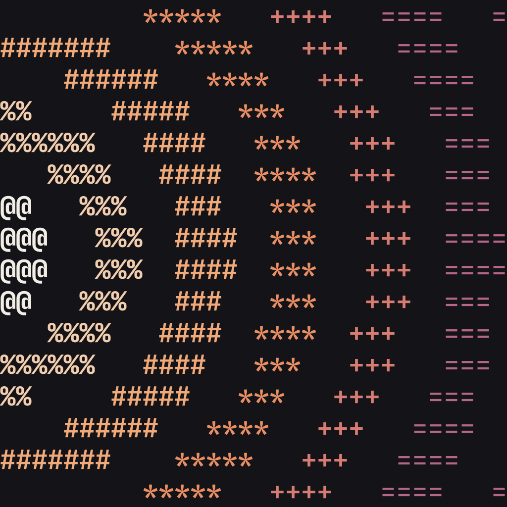
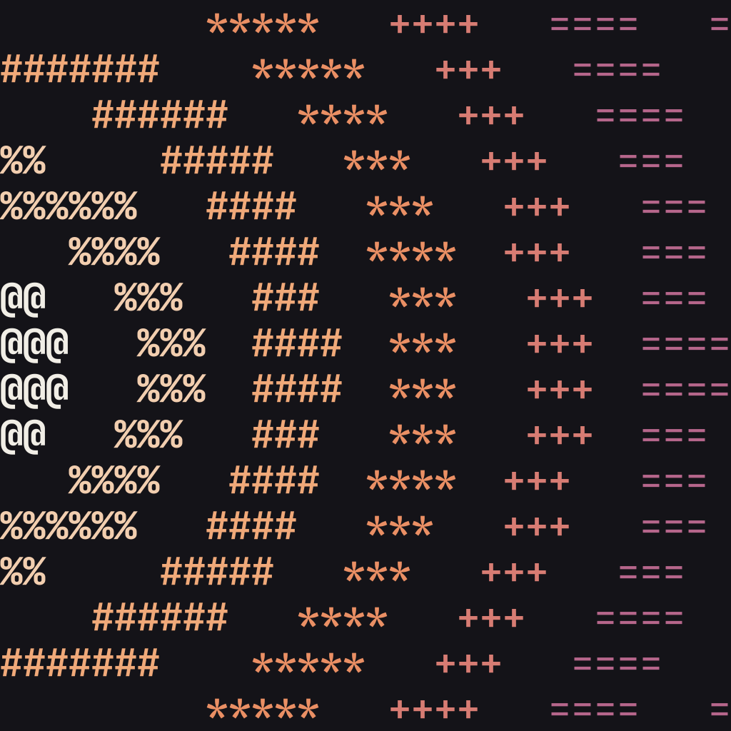
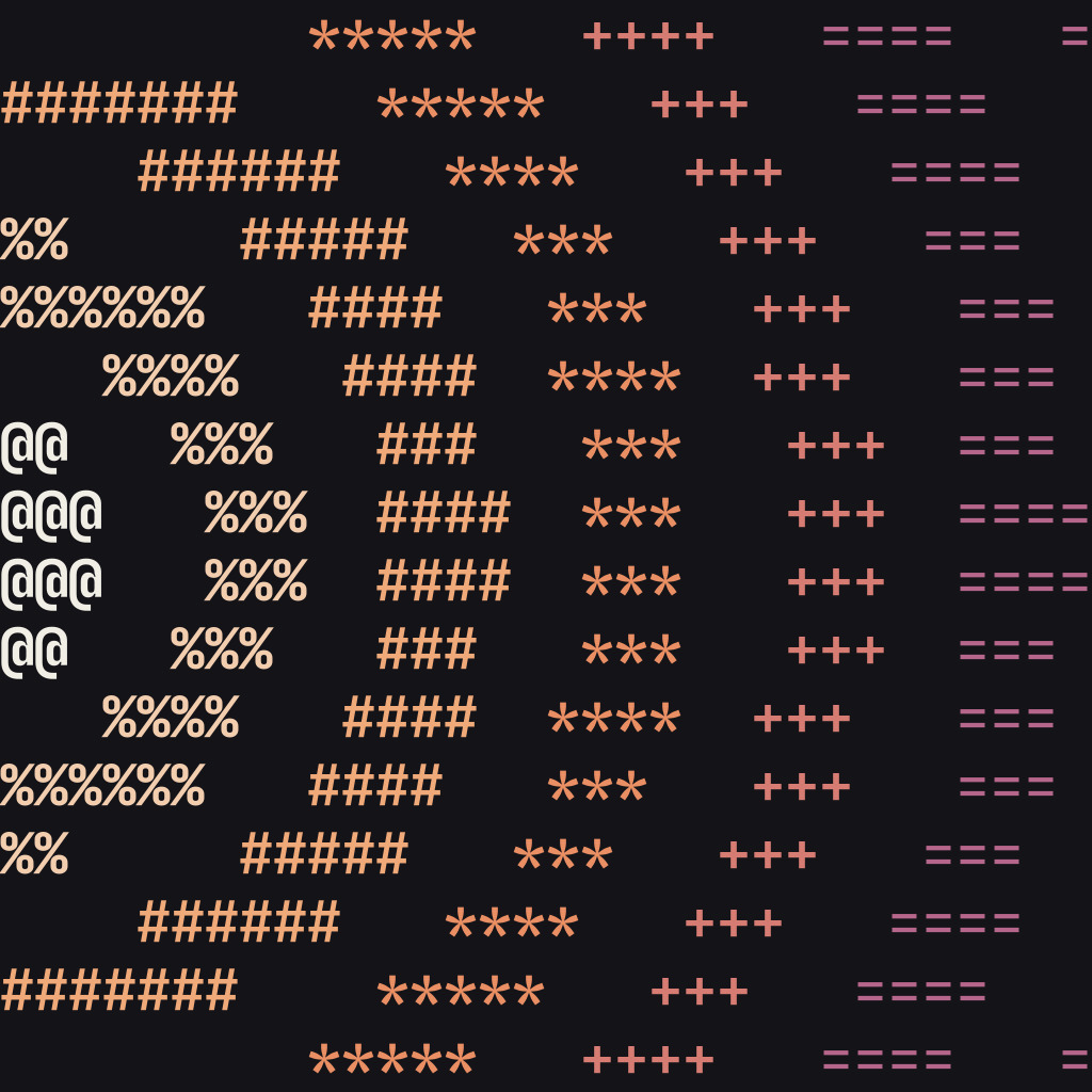
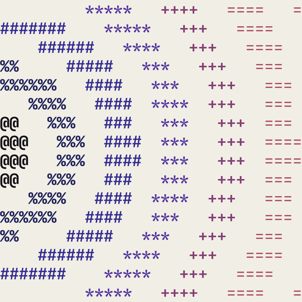
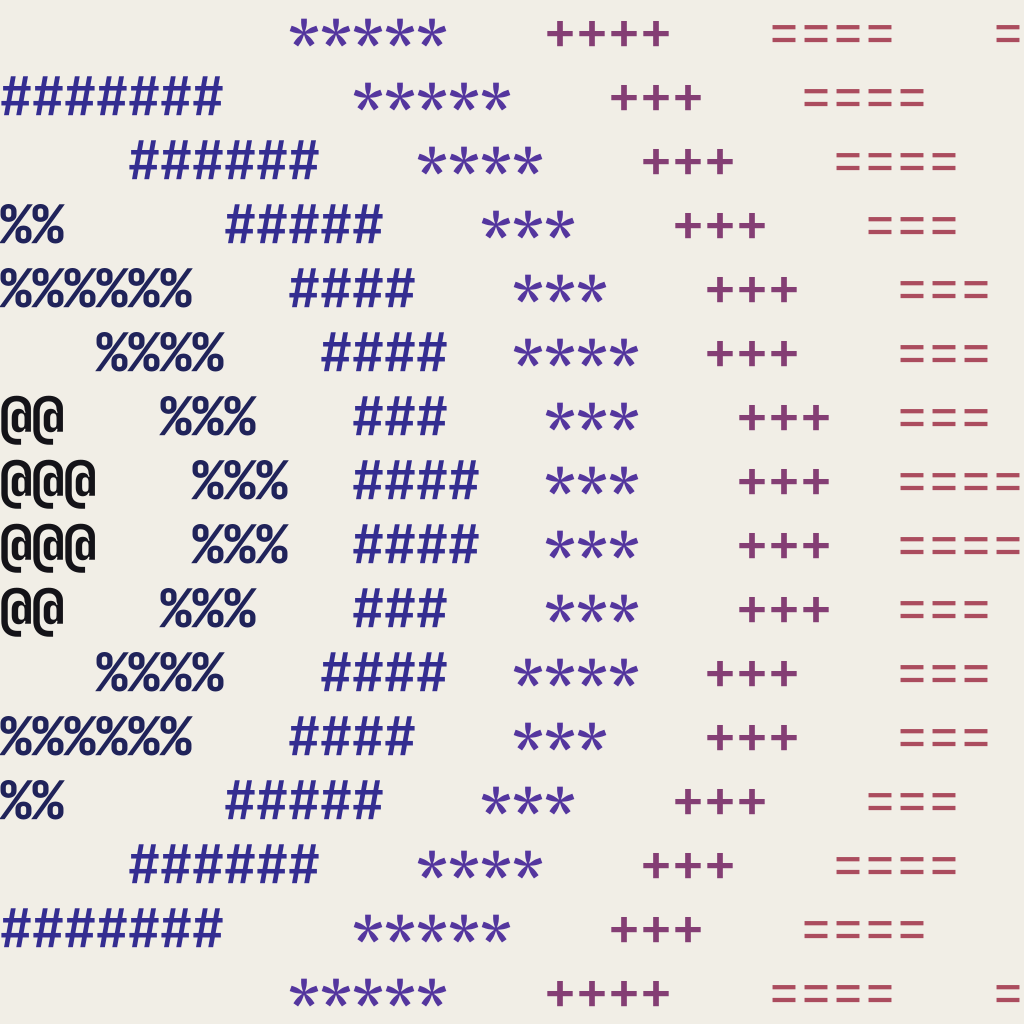
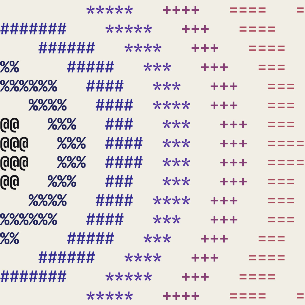
- The icon is the ripple: rings of characters leave the middle of the left edge and fill the tile, each a step further down the ramp,
@ % # * + =. - when
- Where the word cannot fit: the browser tab, the home screen, workspace and server icons, the sticker and the pin.
- how
- Use the files in
brand/iconas they are.tools/iconmakes them; never export the icon by hand.
- One drawing. 32 × 16 cells, the rings 3.4 em apart; the font’s own characters, at the weight their density sets.
- Solid where a cell is too small. At 48 px and below, and on the pin, the rings are bands in the same colours, wider apart as the tile shrinks.
- Never the logo. On a poster, slide or page the wordmark signs. The icon never stands beside it.
download

 180 · home screen
 48
48 3216 · tab
| file | for |
|---|---|
| favicon.ico | the tab: 16, 32, 48 px |
| apple-touch-icon.png | iOS home screen |
| icon-192.png | web app manifest |
| icon-512.png | web app manifest |
| icon-maskable-512.png | manifest, maskable |
| icon-tile.svg | vector, any size |

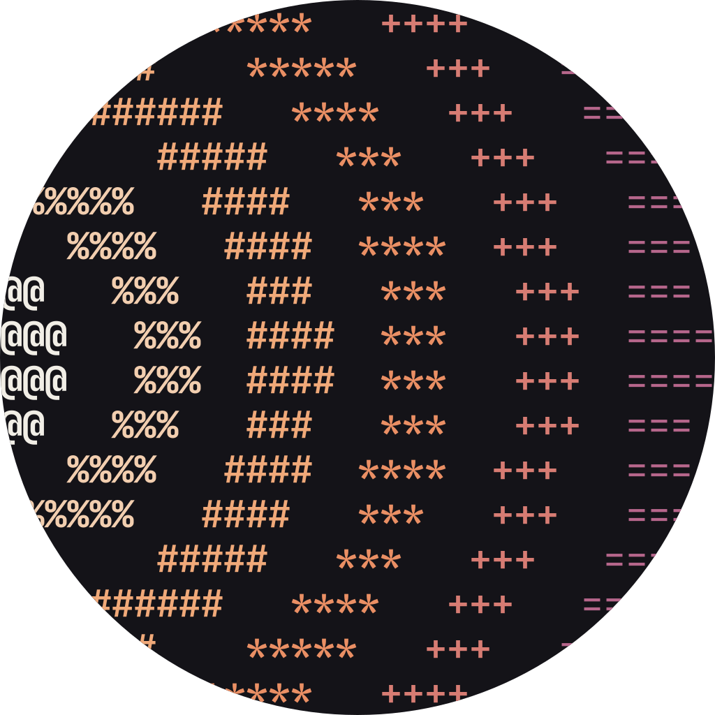
The same rings, round.
- what
- The icon on an ink disc: a square for platforms that crop it round, a file that is already round, and the printed mark, a sticker and a pin.
- when
- Slack and Discord workspace icons, app integrations, any small circle. An account’s own picture is an avatar, p.--.
- how
- Upload the square
icon-squarefile and let the platform cut the circle, or mask it yourself to any shape. Use the roundicon-roundfile where you place a circle yourself: slides, documents, lists.
- The source on the edge. The rings start at the middle of the left edge, which every circle keeps. On the maskable icon the source moves in to the safe zone.
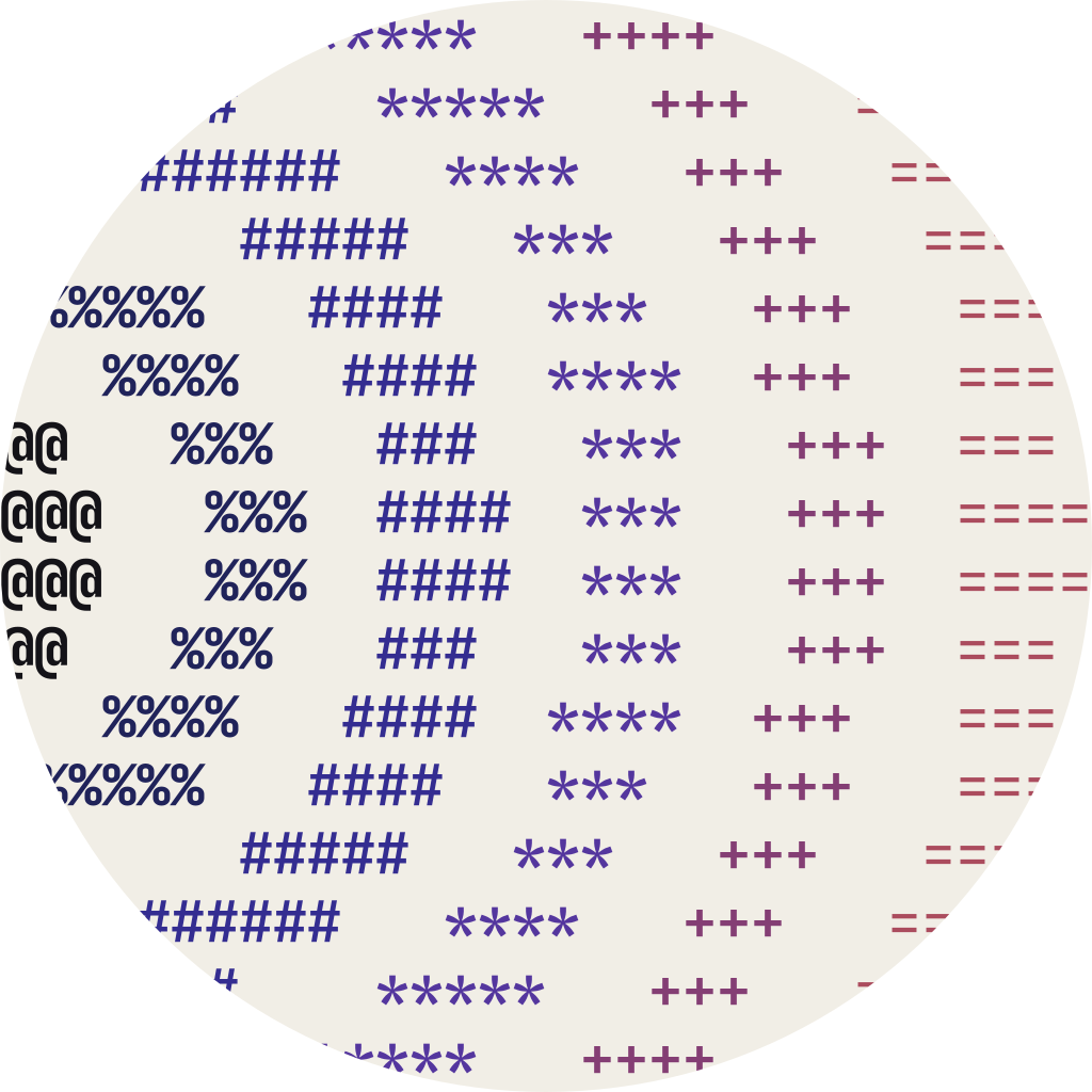
- Ink first. Paper only where the page around it is dark.
- Nothing around it. No badge, frame or outline. The pin’s rim is its metal, not a frame.
download


 sticker · 40 mm
pin · 25 mm
sticker · 40 mm
pin · 25 mm
| sticker | 40 mm, kiss-cut. A 37 mm ink disc on card, cut 1.5 mm outside it. Written: a cell is 1.16 × 2.31 mm. |
| pin | 25 mm, hard enamel. Solid bands, one enamel colour a ring, on ink in a 1.4 mm nickel rim. |
| Outlined characters, layers named for the printer: stock, print, cut; metal, enamel. | |
| screen | On ink or paper: icon-square (SVG, 1,024 px PNG and JPEG; solid bands under 120 px) and icon-round disc. |
On the night, the terminal is the venue.
Badges answer whoami. Signs are commands you can walk. The stage screen goes dark and the speaker stands on its bottom edge, cut out. Everything is printed flat: card, Tyvek, foam board.
$ whoami
marin
niehues
ai-is-easy-until-you-add-people
speaker
no.14
12.11.2026
$ pwd /spoorzone
cd ./talks
cd ./food
cd ./drinks
devpulse no.14thu 12.11.2026admit one
#0142
Things to take home, still made of text.
Printed flat, one or two inks plus the ramp where the process allows. The tee is the city edition: De Peperbus, Zwolle’s 75 m tower, written in characters and lit from the left. It is the one place the city is the subject.
built in zwolle.
de peperbus · 75 m
built in zwolle.
devpulse
tools/peperbus/, masked round for the pinIn practice.
voice and copy · partners and co-branding · quick-start checklist
Say less. Mean it.
Confident, plain, specific. Facts over adjectives. Write the way a good commit message reads.
- Titles are sentence case and end with a full stop. Tech, in person.
- Meta lines are lowercase log style. thu 12.11.2026 · spoorzone, zwolle
- Calls to act are commands. $ rsvp devpulse.nl/rsvp
- Talk titles stay exactly as the speaker wrote them.
- Say what happens and when, never how amazing it will be.
$ git diff copy.txt
The ultimate tech experience in the region!
Tech, in person.
AI: Everything You Need To Know
AI is easy - until you add people.
Thursday November 12th @ 6PM!!
thu 12.11.2026 · 18:00
An unforgettable evening of networking and innovation
Talks. Food. Drinks.
Click here to register now
$ rsvp devpulse.nl/rsvp
Zwolle’s #1 tech community
Zwolle ships.
Hosts and partners, named plainly.
- what
- How a host venue or a partner appears next to DevPulse.
- when
- Posters, slides, the event page, the conference.
- how
- Name the role in log style,
hosted atorwith, then the logo. Keep it apart from the wordmark. Questions or files: jeroen@devpulse.nl.
- One colour. Partner logos in ink on paper, paper on ink. Never on the ramp.
- Never bigger. A partner logo is at most one cell of the wordmark tall.
- Clear space. One cell around each logo, and a hairline between them and the wordmark.
- Never a lockup. No shared box, no plus sign, no merged mark.
devpulse
hosted atpartner logo
A meetup poster in six steps.
- [ ]Collect the facts.
Meetup number, date, venue, doors and talk times, speakers and their talk titles, exactly as written.
- [ ]Generate the evening’s shape.
Enter the key
devpulse no.<n>in the shape lab,tools/event-shapes/. Same key, same shape: never redraw it. - [ ]Get the photos.
The original and a cut-out, head and shoulders, 1,080 px or more, with the speaker’s consent (p.--).
- [ ]Pick the poster.
The cut-out on paper or apricot; on ink for the night version. Turn the speaker toward the text (p.--).
- [ ]Write it.
Title in sentence case with a full stop. Meta lowercase. One call to act:
devpulse.nl/rsvpsample. - [ ]Check before export.
Wordmark is the still, top left. Information is ink. Signal once. Sample content labelled. Export A2, 1:1 and 9:16.
$ devpulse meetup --no 14
thursday 12 november 2026 · spoorzone, zwolle
$ rsvp devpulse.nl/rsvp
made of text.
devpulse
- web
- devpulse.nl
- contact
- jeroen@devpulse.nl
- version
- 1.0 · october 2026